Recently, the apartment’s energy meter was replaced with a digital one. By recent, this was done around the end of June and it went live around July (I might be wrong on the exact dates). The benefit of the replacement was that the data from the device is now easily accessible to all customers through the online account. I’ve been curious about the data and what picture it paints of the consumers.
Getting the data
The first step to accessing the data is quite straightforward. Once logged in to your Oersted account, you can look up your energy consumption where there is a giant download button on the graph element. You can of course filter the element to choose between hourly, daily, monthly and yearly. The data I chose was hourly due to the increased granularity it provides. Once downloaded, you might want to clean up the decimal operator.
First steps
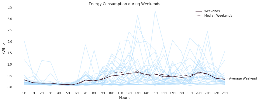
The first plot I plooted was the consumption pattern over every day plotted on top of each other. Once that was plotted, the secnod step was to plot the aggregated means and ranges of the dataset on weekdays and weekends. This allows us to understand the differences in usage patterns during a normal workday and the netflix-binge weekends.
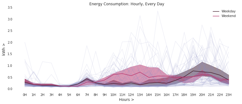
There is a clear difference in how energy is consumed during weekends and weekdays. However, there are some outliers that are also interesting. Considering this is approximately 2-months of data, there are occasions when there is usage during the day (one / two lines) and similarly late in the evening. The best way to visualise the outliers is to see how data behaves during weekdays and weekends. A simple assumption on the outliers are:
- During weekdays, outliers are during the middle of the workday.
- During weekends, the outliers are early during the day or during the evening hours.
- Early during the day means that somebody woke up early than usual.
- Evening hours around 15-18 are usually times when someone is out of the house.
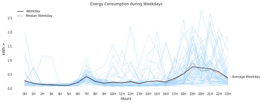
This can be seen in the first figure for the weekday graphs above. The weekdays, show a very low consumption during the day while it sharply increases as everyone rushes home. On weekends, in the graph below, most of us if not all stay home and therefore there shows a more or less uniform energy consumption once everyone has woken up. However, the outliers do exist as the assumptions we make (a) there are days when one of us stayed home during the normal workday and (b) one of us stayed home during evening hours or woke up early during the weekend.
Onwards
The dataset actually helps to pose interesting questions on the behavior of users. It also provides a good amount of scaffolding to explore interesting ideas especially with the current energy transformation that is happening. My idea is to continue to explore the dataset. That will hopefully be the basis of my future blog posts.
2018-11-14: Clean up typos and grammatical errors.