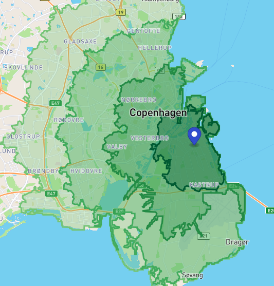
Lately, the real-estate market in Copenhagen has been very interesting for me.
As a data scientist, I’m very much interested in making my life easier in the world of structured data. It is fun to use apps, but there are some ways you may be better off to use a nice-ol' structured dataset to get things done than an user-interface.
There are multiple webapps that allow for an user to interact with the said data. Additionally, I would prefer to be cognitively lazy on tasks that a computer should be better at doing. So, in order to achieve this, I split my process in to the following steps:
- I need to have access to data.
- I need the data to be structured.
- I need to filter and process the data in a way that makes sense for me.
- Have the data available in a form that is usable by people around me to filter and assist in going through the data.
I’ll refrain from talking too much about point numbers 1, and 2. The topic on the end-to-end structure of how this was built is for another time as well.
In this post, I’ll focus on the filtering options that I am interested in.
Filtering Parameters
I had a basic set of parameters that I was willing to search by:
- The place I am searching for is an
ejerlejlighed- that can be translated by wikipedia as a condominium. - The place is between a particular value that can be affordable.
- The apartment / condo is located in a place that is attractive from a public transport sense.
I quickly found out using conventional real estate aggregators that I was not getting the complete picture. I value my time more so that I don’t want to code more at home after work, but rather, sit back and watch Tiger King for the 100th time while the computer does things for me.
I had points (1) and (2) out of the box. Additional metrics were harder to find. I needed to compute them myself. Lets dig into the process of building something around it. But before we start here is my critical question I wanted to answer:
Can I get an additional column that will help in filtering locations by their closeness to public transportation?
Prioritization
The first thing was to get the locations of the public transport stations that I needed as a benchmark. The order of priority for public transport in Copenhagen, for me is:
- Metro -> Fastest and convenient way of getting around
- S-Tog -> Fastest in going larger distances when it works
- Bus -> Works most often but sparser in its network
The above is my view on how I prioritize the transportation system. The best thing about this data should be the fact that they will be quite stable for a long time to come. Unfortunately, my google-fu wasn’t strong enough to get me there. So, naturally getting the basic data was important. The next best thing to Google Maps, which is not proprietary and does not involve me spending hard-money is to use the OpenStreetMaps.
OpenStreetMaps is quite a phenomenal tool a large amount of work done to keep it relatively up to date. So, now that I know my tool, I needed to ascertain data information.
- The data I needed was locations of public transportation.
- The data needs to be up-to date as possible.
- I get a stationary dataset that I can load quickly and painlessly.
The above reasoning is simple, the public transportation data is not going to change much. I am quiet safe not writing an implementation of code that pulls data live every single time. Just need it to be stationary at some place accessible for it to work.
Overpass API
My digging through the API documentation from OpenStreetMaps unearted the Overpass API. It is a great tool with a custom querying structure that supports consumers with getting parts of the data from a location.
A sample query to get buses within a bounding box is as follows:
/*
This query looks for nodes, ways and relations
with the given key/value combination.
Choose your region and hit the Run button above!
*/

[out:json][timeout:25];

// gather results
(
  // query part for: “highway=bus_stop”
  node["highway"="bus_stop"]({{bbox}});
  way["highway"="bus_stop"]({{bbox}});
  relation["highway"="bus_stop"]({{bbox}});
);

// print results
out body;

>;
out skel qt;
I’m not going to say I understand what is happening above. I wanted the data, and I found the fastest way to get that data out. Maybe some other day, I’ll get back to analysing why the model is the way it is. But basically this is how it works:
- the artifact here called
bus_stopis associated with an artifact calledhighway - The qurey basically looks for every node, way and relation that has the value
bus_stopin it. - Once the value is obtained, it prints it for creating a stationary dataset.
I copy-pasted it to a text editor once done to create a structured dataset. If you are interested in knowing more, I’ll urge you to devour the link to the wiki page I have linked earlier and here.
Handling the Data
Now that I had the data in my hand, I had to compute a metric. I had a structured dataset with the address of the property. Now I had to get them back to a point structure of (latitude, longitude) to compute the relevant distances with my transportation data.
In this case my optimisation is simple: D_a < X < D_b where X is the distance of a property to the nearest metro location and D_a and D_b are the boundaries I am happy with. The above formula points to the type of interaction I needed with my data.
In an ideal world, I would love to have a visual map, where I could select a location and an isochrone would pop up to show how far my locations are from points of interest.
In the above example, you can see the isochrone of how far one could get on a bicycle in 15-minute increments. Each shaded and bounded region is the distance that can be covered in cumulatives of 15-minutes. It would’ve worked perfectly, but unfortunately, that is not something easy to build.
But, that is an expensive thing to build. So, the laziest way out is to use a standard formula that is not inaccurate nor imprecise. In this case the (Haversine distance)[https://en.wikipedia.org/wiki/Haversine_formula] suits my purposes by allowing me to be fast, accurate and precise enough to help me with the filtering.
Additionally, the prioritization of the public transport locations proved to be super useful as I only need to focus on my highest priority. The flexibility does remain if I needed to revisit to build it for other locations. But that I could achieve anytime I wanted. My primary priority remains on the highest.
Filtering Haversine Data
Since my data had been structured from the start, all I needed was a column with values that I can filter according to my requirements. And my target usable interface was good ol' MS Excel. Once the haversine data was computed, I got a structured dataset with the following additional columns:
Distance to Public Transportin kilometers to the nearest computed metro station.Name of public transportin string as the name of the metro station that is matches with the distance.
This made the data quite easy to use, as I had an extra column to just apply a filter on to get the relevant data. And I had the liberty to see how well it worked based on how easy it was for my friends / famliy who were helping in sifting through the data found it to be usable.
Conclusion
This blog post is a very general exercise on structuring a data analysis toolset for a particular problem. My initial frustration with not being able to generate the valid information or use the information I needed was the painpoint to building the above system. The focus of the solution ended up deciding how I went through the process. But structuring the data requirement enabled me to get a better understandin of what was necessary:
- Get location data structured
- Compute a metric that solves my requirement
- User interaction with the metric to generate information that I require
I am a data scientist and Excel is the shortest way to handle structured data to do simple filtering. And this was quite well-achieved. My next topic hopefully will be into how I built this thing to serve me well and what I built them on.